How I cut Kirana reordering from 20 minutes to under 7
A B2B repeat-purchase case study · KiranaClub
Vivek Singh
TL;DR
60% of Kirana retailers reorder the same 20–30 products every time, yet spend 15–20 minutes browsing the catalogue on every order.
I designed a known-basket reordering flow that brought this down to 5–7 minutes in testing, while keeping the price-verification step retailers already trust.
Timings observed across 3 moderated prototype sessions. Directional, not production data.
1a
My Role
Research + Design
Discovery
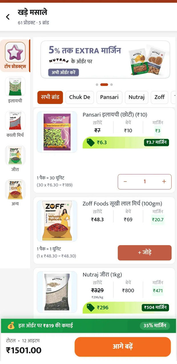
Audited the live ordering flow end to end, capturing the current-state screens directly from the app
Ran an in-person prototype test with 7 retailers to pressure-test the obvious solution
Requested user-context data from the KiranaClub team, which surfaced the low digital literacy and low-end device constraint that shaped every decision after
Design & Validation
Defined the phased scope: what Phase 1 must contain for the solution to work at all
Designed the reorder entry point and basket review flow within the app's existing design language
Tested the designed flow with 3 retailers, iterated the change-detection cue, and documented what remains unresolved
2 weeks
end to end
Mobile app
Android only
B2B
Kirana procurement
that's me
A solo assignment, shown honestly. There was no cross-functional triad to claim.
Setting some context, before we begin…
Context · The current state
What is KiranaClub?
A B2B ordering platform that lets Kirana (neighbourhood retail) store owners buy wholesale stock, including groceries, snacks and household essentials, directly through a mobile app. It replaces manual distributor calls and shop visits.
60%
retailers reorder the same basket
15–20
minutes spent browsing, per order
20–30
SKUs repeated in that basket
Assignment-provided figures, treated as the starting hypothesis for this case study rather than independently verified metrics.
Why the current flow hurts
(from both business & user point of view)
same 5 steps, every single order… the first three are where the time goes
User impact
15–20 minutes of repetitive browsing per order, for products the retailer already knows they want. This reads as friction, not choice, and it costs more on low-end devices with slower load times.
Business impact
The browse-and-search phase (Steps 1 to 3) is the most likely point of drop-off, the place where time, effort and decision fatigue peak. For a platform whose stated goal is reducing retailer friction, this is where friction is currently highest.
Reasoned inference, not confirmed drop-off data.
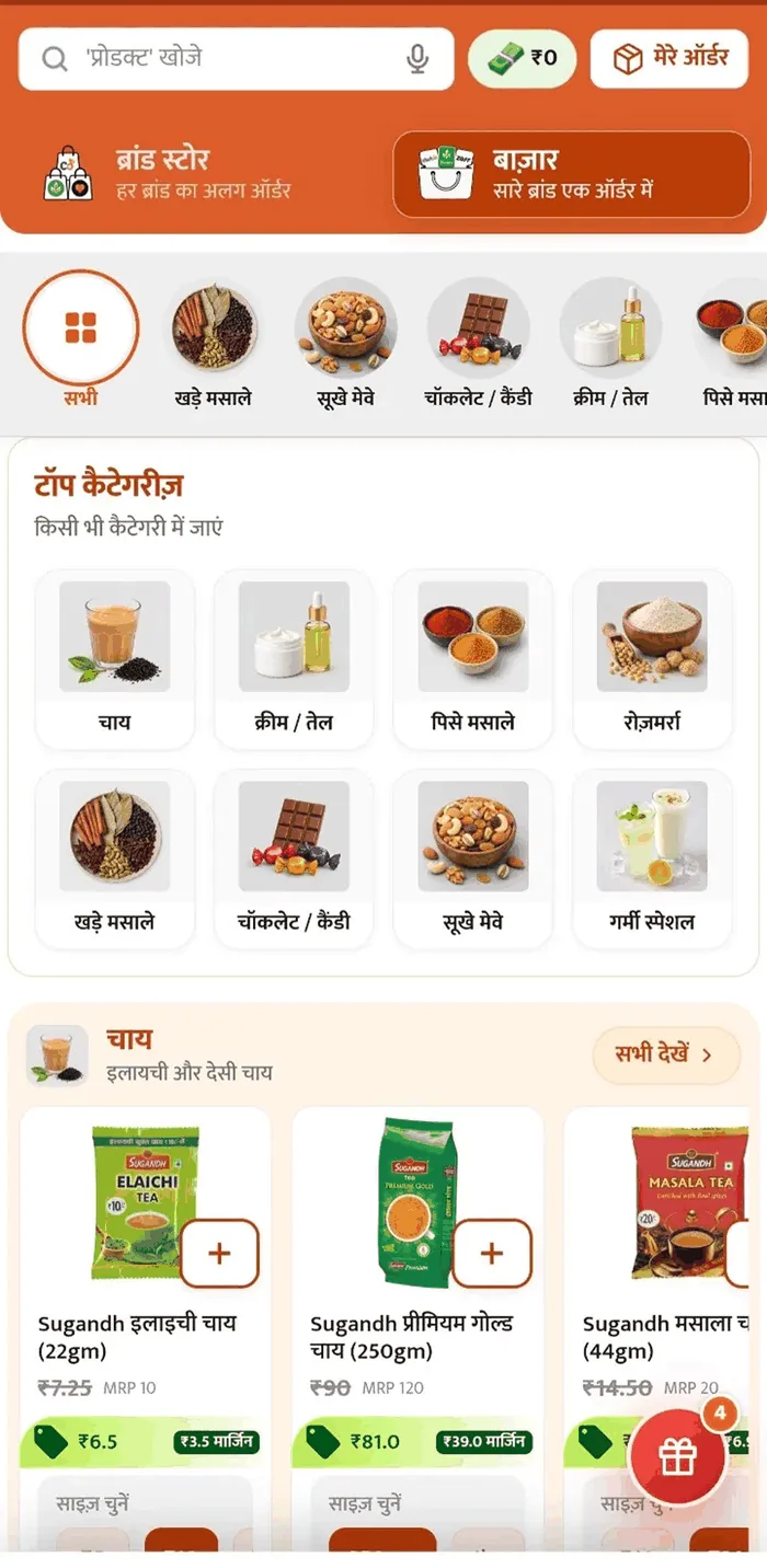
2a
123
1
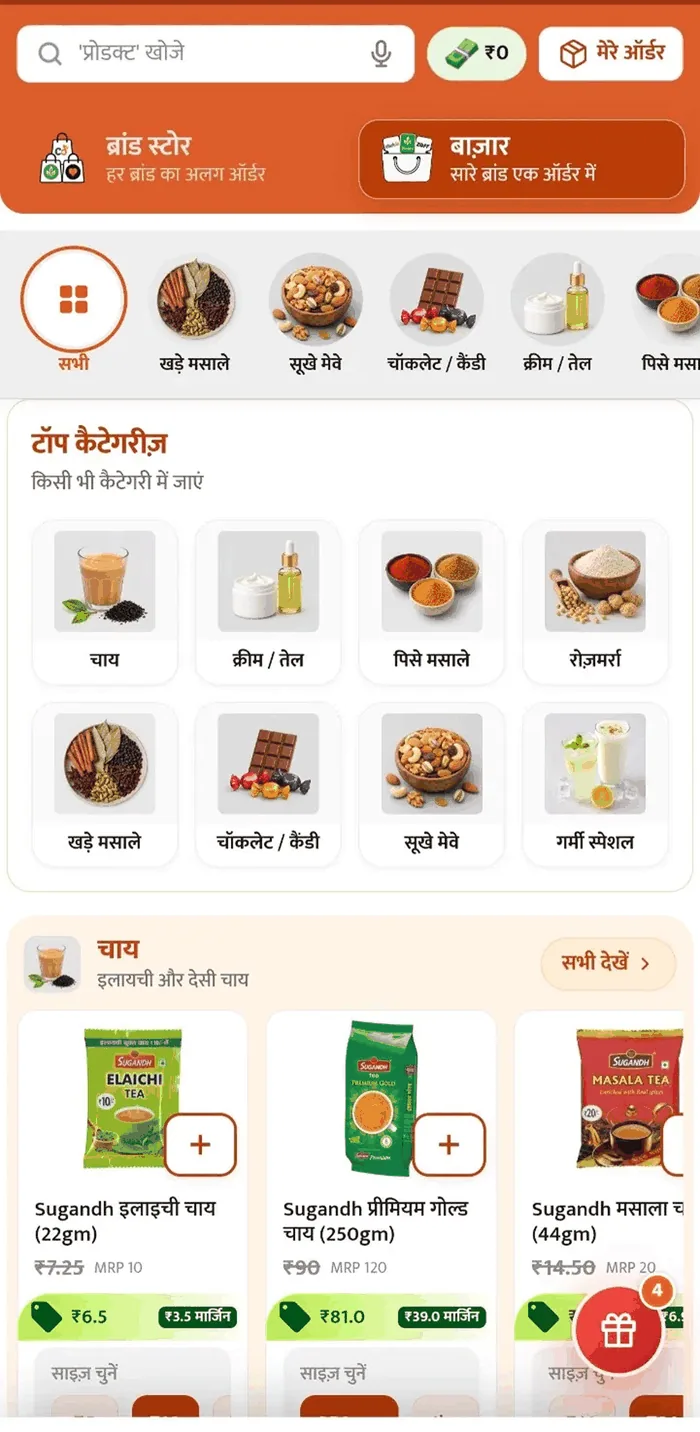
Search bar, used fresh on every visit
2
Two full navigation blocks before any product appears
3
Product rails begin, still with no path for a retailer who already knows their list
Captured directly from the live KiranaClub app. Shown to illustrate the current browse-first flow, not as a validated usability finding.
Discovery · Research
What the obvious solution got wrong
How we got here
Primary research budget was limited, so this stage combined two sources: the current-state data and screens provided by KiranaClub, and a self-built reorder prototype tested in person with 7 retailers, to check whether a simple "repeat last order" shortcut would actually work.
Findings below are directional, based on a small in-person test. They are not a statistically validated study.
7
retailers prototype test
5
current-state screens audited
1
context request to KiranaClub
The "just repeat it" trap
I tested a simple one-tap "repeat last order" prototype in person with 7 retailers. The obvious fix didn't hold up.
Several retailers kept their own informal diary, a notebook where they'd jot down rough costs from previous orders. During the test, they pulled this out to manually cross-check whether prices had changed before trusting a "repeat" action. A one-tap reorder skipped a verification step they clearly weren't willing to give up.
The second concern was quantity, not price. Retailers didn't always want the exact same amount of every item repeated. Some wanted more of a fast-moving product that week, less of something slow-moving, and didn't trust the app to know that.
Observed behaviour, not verbatim quotes
Retailers manually verified prices against their own written records before repeating an order
Quantity per item was treated as variable, not fixed, tied to that week's demand rather than habit
Why this matters
This reframes the design problem. It isn't "automate the repeat". It is "make reviewing and adjusting a repeat basket fast." A trustworthy shortcut, not a blind one.
their system already exists… and right now it's more trusted than the app
1-tap reorder
The rejected approach. Fast, but it removed the check.
Asking the question no one had asked yet
Before jumping into flows, I asked KiranaClub a basic but often-skipped question: who is actually using this, and what's their day-to-day context? The answer reframed the whole problem. This isn't a general e-commerce audience. Retailers using the app skew toward low digital literacy and low-end Android devices on limited mobile data.
That single question changed my design constraints from day one: no assumption of app fluency, no data-heavy interactions, high-contrast UI, large touch targets. A fast reorder flow that a low-literacy user on a slow connection can't actually use isn't a solution.
Sourced directly from KiranaClub on request. Not part of the original assignment brief.
Weak signal
Large targets
Low-spec phone
No formal personas on this page. With 7 informal sessions there wasn't enough signal to build them honestly.
Problem definition
From research to a design question
The research surfaced two things that don't get along on the surface: retailers want speed, because they're repeating the same basket, but they don't trust speed enough to skip verification, meaning checking price and adjusting quantity. A good solution has to earn trust while saving time, rather than trade one for the other.
Speed
repeat the basket
Trust
verify before committing
The design question
How might we help retailers rebuild their known basket in seconds, while still giving them fast, trustworthy control over price changes and quantity adjustments?
Initial framing
"How might we make reordering faster?"
Refined framing · after testing
"How might we make reordering faster without removing the verification step retailers already trust?"
What similar platforms do, and where they fall short
Feature
Udaan
Jumbotail
ShopKirana
DealShare
One-tap repeat order
✓explicitly advertised
✕not shown
✕
✕
Editable quantity before repeat
not publicly confirmed
·
·
·
Price-change alert on repeat
not publicly confirmed
·
·
·
Simplified / multilingual UI
✓
✓strong focus
partial
✓
Built for low-end device / data
not confirmed
✓data-pack support
not confirmed
not confirmed
nobody is solving this
The opportunity
Even where "repeat order" exists (Udaan), none of the platforms researched appear to solve the specific trust gap this research surfaced: a visible way to catch price changes and adjust quantity without re-browsing the full catalogue.
Based on publicly available app store listings and product marketing, not hands-on testing of competitor apps. Feature availability may differ in-app. Amazon "Buy Again" was considered as a consumer benchmark and deliberately dropped, keeping the comparison set B2B and India-specific.
Strategy · Scope
Where the 15–20 minutes actually goes
The repeat-order journey, mapped
three steps of re-finding what they already knew they wanteddon't optimise this away, this is the step retailers trust
What to solve first
#
Opportunity
Impact
Effort
Phase
1
A known-basket entry point: a route into reordering that doesn't start with browsing
High
Low
Phase 1
2
Price-change visibility: surfacing what changed since last order
High
Med
Phase 1
3
Fast quantity adjustment: editing amounts without re-entering the catalogue
High
Med
Phase 1
4
Discovery that stays additive: deals and new margin items offered after the basket is built
Med
Med
Phase 2
5
Seasonal and festival basket shifts: recognising that Diwali and Holi baskets differ structurally
High
High
Phase 3
Phase 1 · Rebuild the basket, keep the trust
Entry point, price-change visibility and quantity control. This is the minimum that makes reordering fast without removing the verification retailers already rely on. These aren't three features. They're one feature that needs three parts, and shipping the entry point alone would rebuild the exact prototype retailers rejected.
Phase 2 · Protect discovery
KiranaClub's business depends on retailers finding new and higher-margin stock. Discovery only becomes solvable after the basket is fast, because that's what frees up retailer attention. Doing it first would solve the business's problem before the user's.
Phase 3 · Seasonal intelligence
Festival demand restructures the basket entirely. High value, but it needs order history across multiple seasons to be trustworthy, so it follows rather than leads.
Not a phase, a filter
Low digital literacy, low-end Android devices and limited mobile data aren't a Phase 3 concern to be handled later. They're a filter every phase has to pass through. A solution that only works on a fast connection isn't a Phase 1 solution that needs polishing. It's the wrong solution.
Effort estimates are my own inference. With engineering input from the KiranaClub team this prioritisation would be sharper, particularly around what basket data can be cached locally versus fetched per session. This page phases problems, not features: at this point in the narrative no solution has been chosen yet.
Ideation · Explorations
Where does the shortcut live?
Phase 1 needs an entry point into the known basket that doesn't begin with browsing. But where that entry point sits changes what it means. A shortcut buried in a menu is a feature; a shortcut on the landing screen is a statement about who the app is for.
Option A
"My Regulars" as a fourth tab
Bottom navigation gains a new tab beside Feed, Order, Category and Deals.
Why it works
Permanent, predictable location, which matters enormously for low digital literacy, where discoverability depends on things not moving
Zero interference with the existing Bazaar flow
Simple to build; likely reuses existing list components
Why it fails
Adds a fifth tab to a bar that already has four. Crowding hurts most on small, low-end screens
A tab is passive; the retailer still has to know it exists and choose it. For someone who has always browsed, the habit doesn't change on its own
Competes with "Order": two entry points that both mean "buy things" is a comprehension problem in any language
Option B · chosen
Reorder surface on the Bazaar landing screen
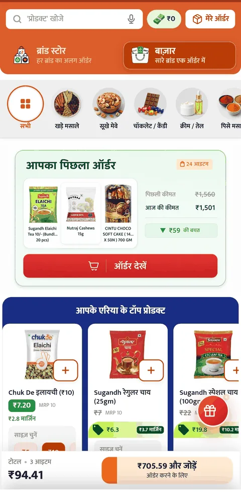
The known basket occupies a block on the landing screen, above the main category navigation.
Why it works
Meets the retailer where they already land, with no new navigation to learn
Directly inverts the problem identified on Page 2: the screen currently leads with discovery for a user on a repeat mission
Discovery isn't removed, it's sequenced. It sits below the basket rather than in front of it
Why it fails
Consumes valuable screen space that currently earns KiranaClub margin through deals and brand placement, a real commercial cost
Unhelpful for a genuinely new retailer with no order history; needs an empty state that doesn't look broken
Risks the landing screen becoming two competing pages stacked on each other
Option C
Reorder prompt at the point of intent
A bottom sheet appears on entering Order or Bazaar: "Load your usual basket?" with a dismiss option.
Why it works
Zero permanent screen cost; discovery real estate untouched
Appears exactly at the moment of intent, requiring no memory of where a feature lives
Easy to make optional
Why it fails
Interruptive by nature; a modal appearing every session becomes something to dismiss reflexively
Poor fit for low digital literacy, because a transient element that disappears teaches nothing about where the feature lives
If dismissed accidentally, there's no obvious way back to it
Decision
Chosen: Option B, the reorder surface on the Bazaar landing screen.
Option A treats reordering as a destination the retailer must choose to visit. Option C treats it as an interruption. Only Option B treats it as the default mission, which is what the research showed it to be for 60% of orders.
The commercial cost is real. But Page 5's phasing answers it: discovery moves below the basket, not out of the app. A retailer who finishes procurement in 5 minutes instead of 20 has more attention left for deals, not less. That's the bet, and it's testable.
This choice is reasoned, not yet validated. The trade-off between landing-screen space and procurement speed is exactly the kind of decision that should be A/B tested rather than argued.
Option B, specified
Screen order after the change
Search bar (unchanged)
ब्रांड स्टोर / बाज़ार toggle (unchanged)
Category icon row (stays visible)
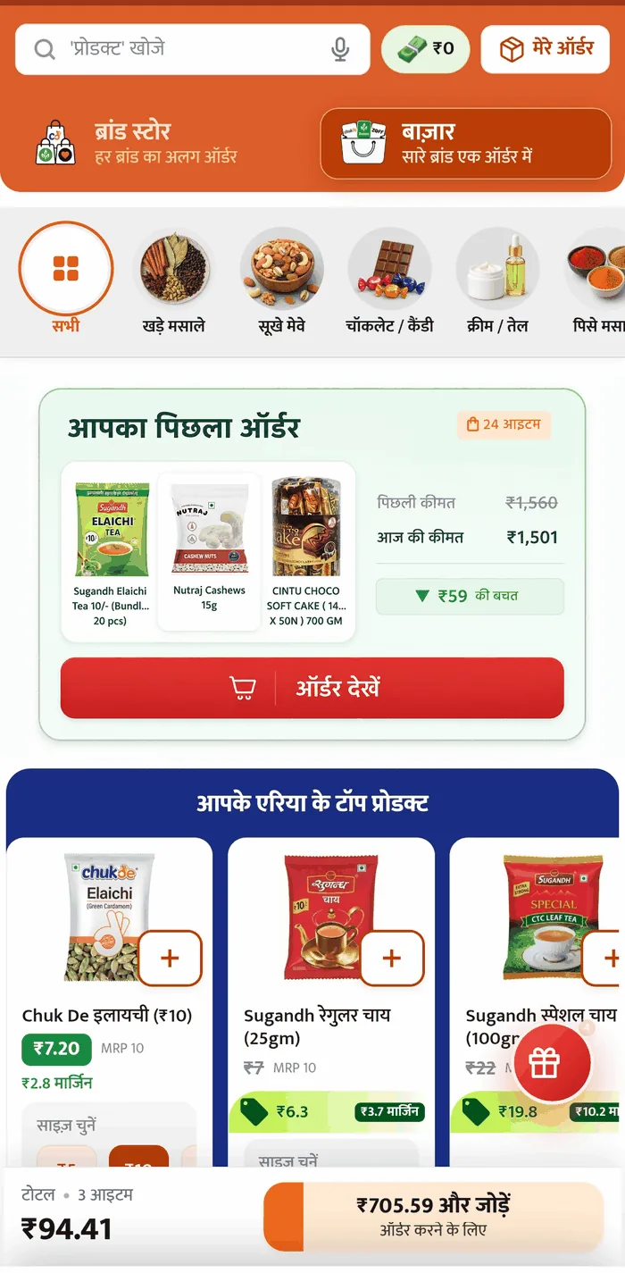
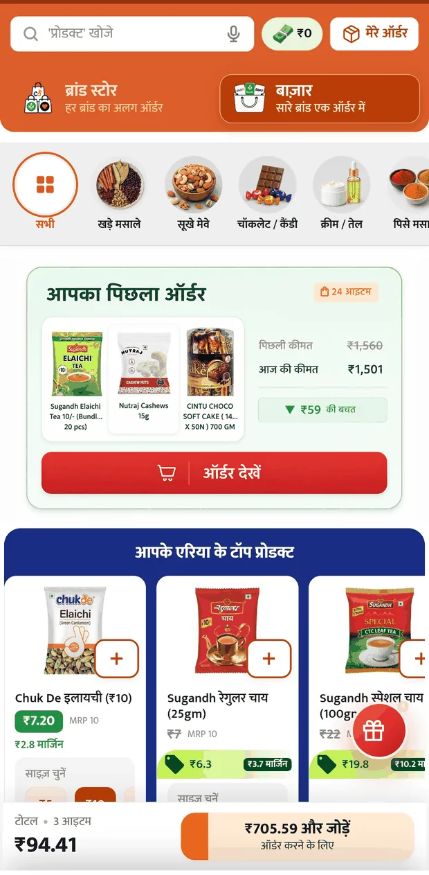
NEW: पिछला ऑर्डर block
टॉप कैटेगरीज़(pushed down)
Product rails (pushed down)
The block sits above टॉप कैटेगरीज़ but below the category icon row. The icon row is thin and scannable and costs little to leave in place. The full-height grid is what actually blocks a repeat mission.
3a
123
1
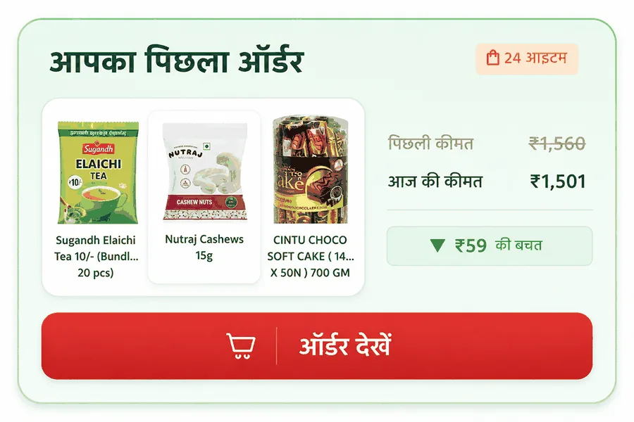
Heading and item-count badge
2
50/50 split: three thumbnails from the last order against the price comparison
3
Full-width CTA
3b
In place on the landing screen, sitting between the category icon row and टॉप कैटेगरीज़.
The rule this card has to obey
Arrow direction, colour and wording must always agree. An early version had a down arrow sitting on a red "costs more" tag. It was caught in review, and it's the kind of contradiction that quietly destroys trust in a number.
▼ ₹59 की बचत
decreased · down · green
▲ ₹59 ज़्यादा
increased · up · red
How the CTA got its name
बास्केट देखें
ऑर्डर देखें
Rejected:बास्केट is an English loanword. It doesn't appear in the spoken Hindi of a low-literacy shopkeeper, and a word that has to be decoded is a word that costs time.
Final:ऑर्डर देखें reuses vocabulary the app already teaches: मेरे ऑर्डर, ऑर्डर details. It also still promises review, not commitment.
Still open
Choosing the entry point doesn't answer what happens inside it. These are interaction problems, not placement problems.
?
Price change
?
Quantity edit
?
Missing item
Interaction design · The core screen
What happens after "ऑर्डर देखें"
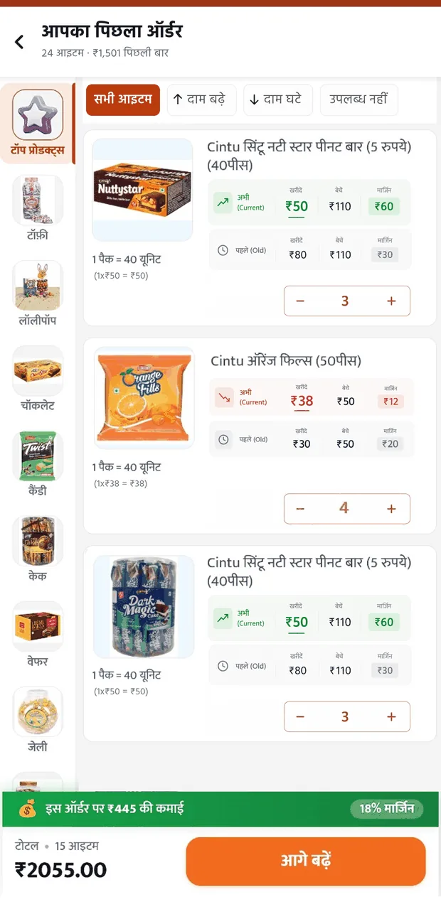
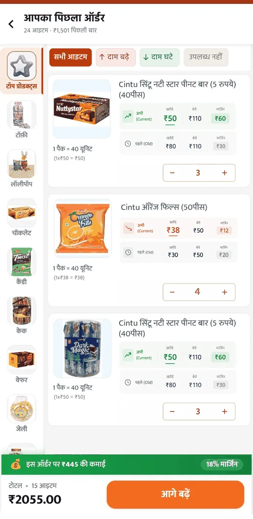
Page 6 decided where the shortcut lives. This is what sits behind it: the screen the whole solution succeeds or fails on. The retailer arrives here with a known list in their head and, often, a diary in their hand. This screen has to be faster than the diary, and at least as trustworthy.
Built on a screen they already operate
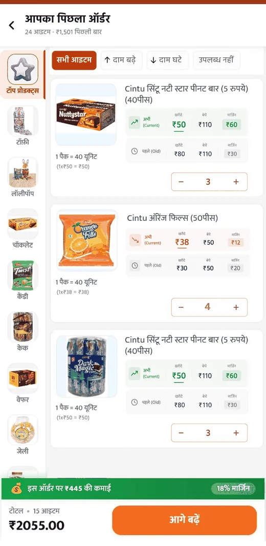
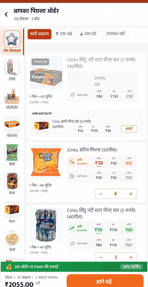
The basket review is built on the existing category-listing pattern retailers already use daily: left-hand group rail, product cards in the centre, ख़रीदें / बेचें / मार्जिन on every card, stepper controls for quantity, running total pinned to the bottom.
Nothing about how to operate this screen is new. Only what it contains is new: the retailer's own last basket instead of a catalogue.
Design principle
For a low-digital-literacy user, familiarity outperforms clarity. A pattern parsed correctly by habit is worth more than a better pattern that has to be learned.
The left group rail carries over unchanged, grouping the retailer's own basket by category. Useful for a 24-item list, and again, no new interaction to learn.
4a
Today · catalogue
Product card
Left group rail
Stepper
Total bar
4b
Proposed · their basket
Same skeleton, different contents.
Interaction design · Verification
Where verification happens
5a
1234
this line is the notebook
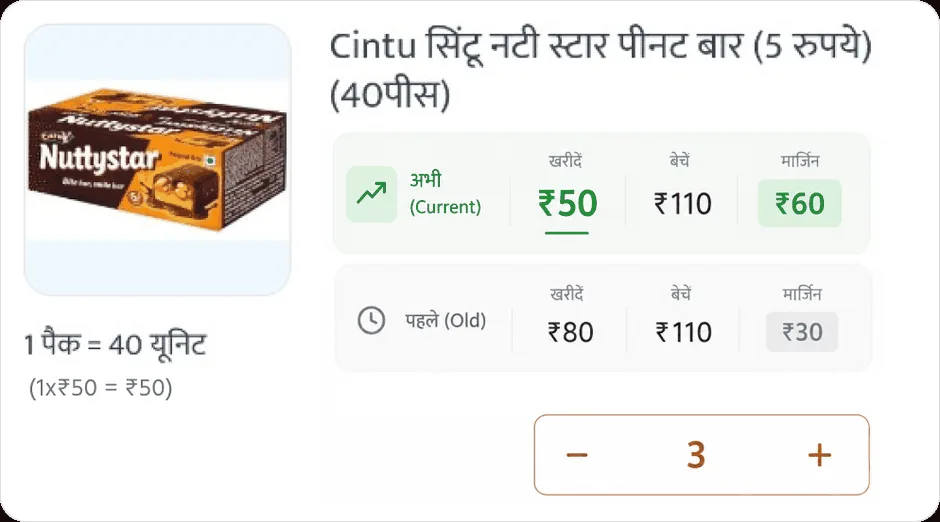
Card anatomy
#
Element
Purpose
1
Product image, name, pack size (1 पैक = 40 यूनिट)
Unchanged from the existing pattern
2
Currentख़रीदें / बेचें / मार्जिन
What they'd pay today
3
Last order'sख़रीदें / बेचें / मार्जिन, directly beneath, muted
The diary, built into the card
4
Stepper pre-filled with last order's quantity
Speed by default, adjustment by tap
The trade-off: pre-filled vs. blank quantities
Option 1 · Pre-fill last order's quantities
Fastest path; an unchanged basket can be reviewed and confirmed in under a minute
Matches the mental model of "repeat my order"
Requires no typing on a low-end device, where keyboard input is slow
Risks passive acceptance, confirming 24 quantities that weren't consciously chosen
Testing showed quantities aren't static week to week
A wrong quantity costs the retailer cash flow, not the platform
Option 2 · Show last quantity as reference, leave field empty
Forces a conscious decision on every line
Preserves the verification behaviour retailers already trust
24 manual entries may be slower than the current flow
Punishes the common case, an unchanged basket, to protect the rare one
High typing burden on low-end devices
Decision
Chosen: pre-fill quantities, with last order's price shown on every card.
Speed comes from the pre-fill. Trust comes from the card never hiding the previous number. The retailer doesn't have to rely on the system having flagged the right items. The comparison they were making manually is present on every line, whether or not anything changed.
Design principle
The diary wasn't a workaround for a missing feature. It was the retailer's verification ritual. This card doesn't replace it. It performs it in the same place they'd have looked.
Repurposing the brand filter
The category screen already has a horizontal filter row, and retailers already use it. Rather than introducing a new alert pattern, the same control is repurposed, filtering the basket by what changed rather than by brand.
A retailer in a hurry taps दाम बढ़े, reviews only the items that got more expensive, and moves on. A retailer who wants to check everything scrolls the full list, as they would today. The design doesn't decide which kind of retailer they are on a given day.
Existing · brand chips
सभी ब्रांडChuk DePansariNutraj
Proposed · change chips
सभी आइटम↑ दाम बढ़े↓ दाम घटेउपलब्ध नहीं
Engineering constraints
Designing for the actual device
Constraint
Low-end Android devices, limited mobile data, unreliable connectivity in semi-urban areas.
What this screen loads
The retailer's own last order, a bounded payload of 20 to 30 items, rather than a catalogue query. Item names, images, pack sizes and last-order prices can persist locally. Only current prices need fetching.
The risk this creates
Because every card shows current price above last price, the screen is only trustworthy once current prices have synced. If cached data renders instantly and live prices arrive a moment later, the retailer may begin reviewing against numbers that then change underneath them. That is a worse trust failure than a slow load.
The resolution
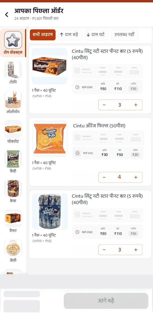
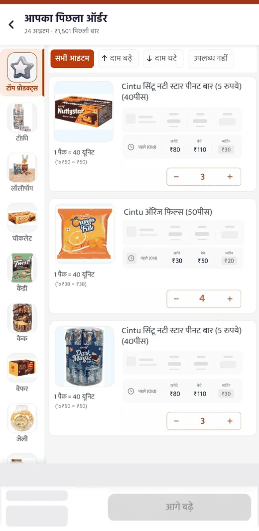
The basket renders immediately from cache with current-price fields in a loading state, and the आगे बढ़ें action stays disabled until sync completes. The retailer sees their basket instantly; they just can't commit against stale numbers.
Three states, in sequence
6a
01 · Cached
Basket from cache, current-price fields as skeletons, CTA disabled.
6b
02 · Synced
Current prices populated, changes visible, CTA enabled.
6c
03 · Offline
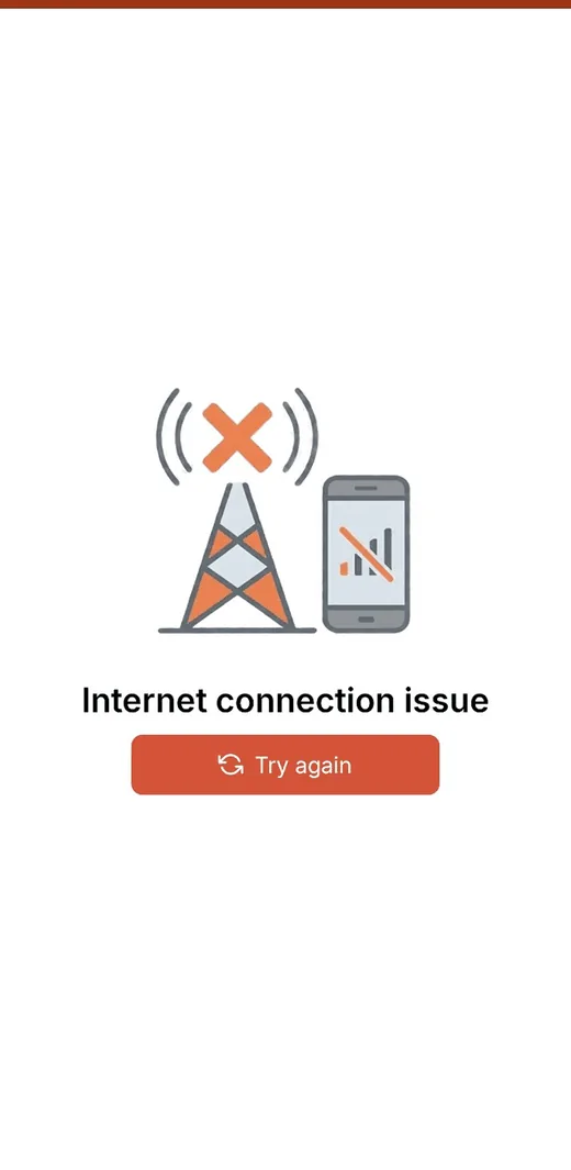
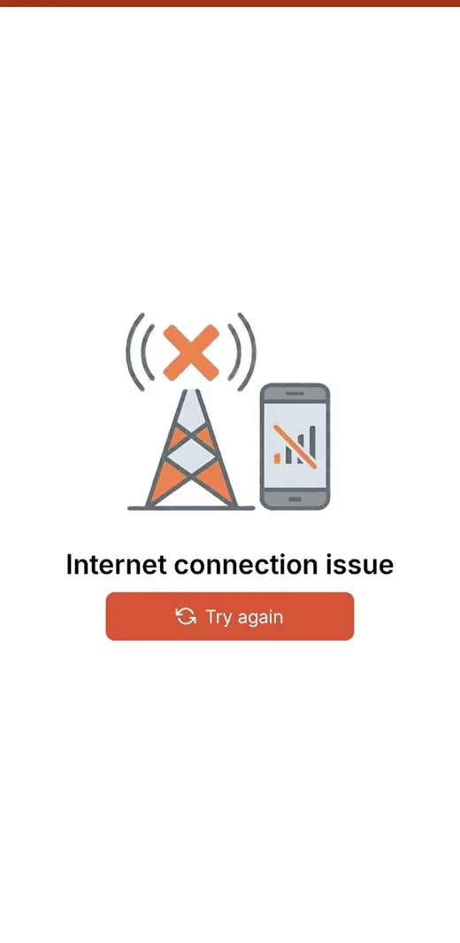
This is the real screen shown app-wide when offline. It appears before the retailer can reach any flow, including this one.
State 3 · not designed, because it can't occur as proposed
The app already gates all functionality behind this global offline screen at launch. The offline-basket behaviour originally proposed here, meaning read-only access with the order held locally, assumed the retailer could still open the basket while offline. In reality, they can't get past this screen to try.
This wasn't caught during initial design. It surfaced when checking the concept against the real app. Resolving it needs a product decision: either carve out an exception to this global gate for a cached reorder basket specifically, or accept that offline access to this flow isn't currently possible and drop it from Phase 1's requirements.
Offline behaviour · as proposed
No connection means no current prices, which means no trustworthy reorder. Rather than fail, the basket would load read-only with prices marked as last-known, holding the order locally until connectivity returns. A retailer could prepare an order in a dead zone, just not commit one.
Stated as a proposal, not shipped behaviour. It is contingent on an app-wide architecture change to the existing offline gate described above, and that change has not been confirmed as feasible.
What I couldn't find out
Two things would have made this section specific rather than principled, and I wasn't able to confirm either:
1
Is order history cached client-side, or fetched per session? This determines whether instant basket load is real or aspirational. I've designed assuming a bounded order-history payload can persist locally.
2
How often do wholesale prices actually change on the platform? If daily, change-visibility is the core feature. If monthly, it's closer to an edge case, and Phase 1 would be weighted differently.
Both decisions here are designed against reasonable assumptions, not a confirmed architecture. With access to KiranaClub's engineering team this section would be scoped rather than inferred, and I'd expect at least one of these choices to change.
the screen was fine. the assumption behind it wasn't
Validation · Testing & iteration
What broke, and what I changed
I tested a clickable prototype of the basket review flow in person with 3 KiranaClub retailers. Each was given one instruction, "open the app and order your usual stock", with no explanation of the new screen.
3 participants, moderated in person. Small enough that findings are directional, not conclusive. Timings were observed, not instrumented.
✓
Finding 1 · The entry point worked
All 3 retailers found the पिछला ऑर्डर block without prompting and understood what it would do before tapping it. One began adding items through the usual category flow out of habit, then noticed the block 2–3 seconds in and switched to it.
Habit briefly overrode the new path, but the block was prominent enough to interrupt it. This supports the landing-screen placement. A shortcut in a tab or a dismissible sheet would likely have lost that user.
7a
!
Finding 2 · Pre-filled quantities were understood, but never used
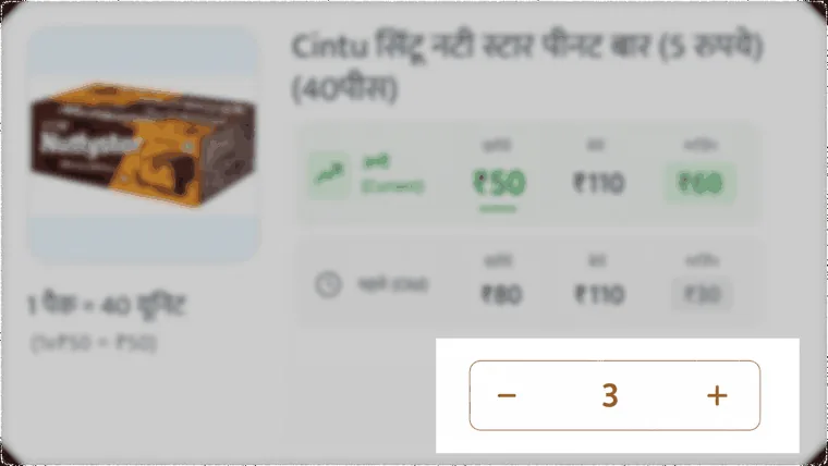
All 3 retailers immediately understood that quantities were carried over from their last order and that the stepper let them adjust. None of them actually adjusted a quantity during the session.
Honest reading · unresolved
This is ambiguous, and I'm treating it as unresolved. It may mean the test baskets genuinely needed no adjustment, or it may mean pre-filling encourages passive acceptance, the exact risk flagged during design. A short moderated session can't distinguish between the two. Resolving it needs either a test where the correct answer requires adjustment, or live data on how often quantities get edited.
7b
The control everyone understood, and nobody touched.
3
Finding 3 · Price changes were noticed, but the cue was too quiet
Retailers did notice that current and previous prices were both shown. But the change filter chips (दाम बढ़े / दाम घटे) went unfound initially, and retailers asked for a stronger visual signal.
Iteration
I replaced the plain chips with a solid colour treatment: red for price increased, green for decreased. After the change, retailers could spot changed items, though some still needed a small nudge before recognising what the colours meant.
Colour alone isn't sufficient for this user group. A next iteration should pair colour with an explicit label or icon rather than relying on it, and colour-only signalling is an accessibility problem regardless.
दाम बढ़े
Before · plain chip
↑ दाम बढ़े
After · colour
4
Finding 4 · The cart needs the same comparison
Retailers expected to verify prices in two places, not one. Per-item on the review screen, and again in aggregate at the cart: has my total changed since last time?
Their diaries tracked both: rough per-item costs, and what the order came to. The design solved only the first.
Iteration
Add a comparison view at the cart, showing item name, quantity, current price and previous price in tabular form, with the previous order total displayed alongside the current one.
Item
Qty
Now
Last
Cintu Nutty Star
3
₹150
₹240
Cintu Orange Fills
4
₹152
₹120
Dark Magic Cake
3
₹150
₹240
Total· 24 items
₹1,560 last time ₹1,501
Proposed cart comparison
they found the gap, not me
5
Finding 5 · The notebook stays, and that's fine
All 3 said they'd keep their notebook. When asked why, the reason wasn't distrust of the prices shown. It was that a phone can be lost and app data can disappear, so a physical record has to exist.
This reframes the goal
The diary isn't a workaround for a missing feature. It's a backup against device and data loss, which no interface change can address. The design doesn't need to replace the notebook. It needs to be faster than consulting it. Measured against that goal, it succeeded.
Result
5–7 min
to complete a full reorder, against a 15–20 minute baseline
Observed across 3 sessions, timed manually. Directional, not statistically meaningful.
Beyond the happy path
Designing for what usually goes wrong
Everything so far assumes a retailer with order history, a working connection, and items that still exist. In practice none of those hold reliably. The users here are on low-end devices in semi-urban areas, ordering from a catalogue that changes underneath them.
States of the basket screen
8a
Default
Full basket, prices synced, CTA enabled. The happy path.
8b
Loading · cached
Basket from cache, price fields as skeletons, CTA disabled. Instant render, no commitment against stale prices.
8c
Offline
The app's global offline screen, the same shot as 6c. See Page 7C for how this was discovered.
8d
Empty · new retailer
Not a new state, and the same shot as 2a. If there's no order history, the entry condition for this feature isn't met, and the retailer sees the current app unchanged.
8e
Partial basket
Some items available, some not. The most common real state; it must not block the order.
Business edge cases
Edge case 01
Item permanently discontinued
Treated identically to a temporarily unavailable item, because the retailer's need is the same either way: see that the line is gone, and get a workable alternative without leaving the basket. It uses the same screen design as the Partial basket state above (8e), where the line is marked उपलब्ध नहीं, the last-order prices stay visible, and a substitute is offered inline with its own margin shown. The retailer decides; the system suggests.
Edge case 02
Large price spike
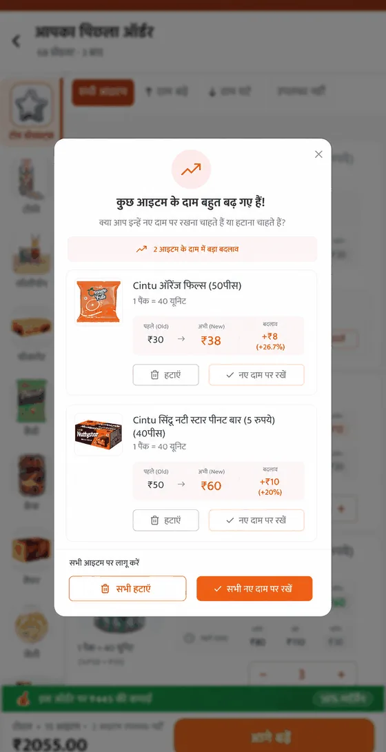
A price that has moved sharply since the last order shouldn't just be flagged in colour. It warrants an explicit confirmation step before the order proceeds. A retailer protecting thin margins should never discover a significant increase after committing.
Why this is an interrupt, not a stronger tag
Page 8's testing showed the honest limit of inline signalling: retailers missed the change chips entirely on first pass, and even after the colour iteration some needed a nudge to read them. Scanning a list of 24 cards, a tag is something you might notice. A large price movement is too expensive to leave to chance-scrolling, so instead of competing for attention inside the list, it stops the flow and asks a direct question. The cost is an interruption; the alternative is a retailer discovering the increase after the money is committed.
Increases only · deliberate
The modal fires for price increases and not decreases. A large drop is welcome news; it carries no cash-flow risk and doesn't need a forced decision. It stays a green in-list indicator, where it belongs.
Trigger threshold remains an open question, listed below. I don't have the price-movement data to set it responsibly.
8f
8f · price-spike modal
Modal, top to bottom
Warning icon, an upward trend arrow in a soft red circle
Heading कुछ आइटम के दाम बहुत बढ़ गए हैं!
Sub-line क्या आप इन्हें नए दाम पर रखना चाहते हैं या हटाना चाहते हैं?
Summary chip ↗ 2 आइटम के दाम में बड़ा बदलाव
Per-item cards: image, name, pack size, then a price transition row पहले (Old) ₹__ → अभी (New) ₹__ with a बदलाव column carrying both the rupee amount and the percentage, for example +₹8 (+26.7%)
Two actions per item: हटाएं (outlined, red icon) and नए दाम पर रखें (checkmark)
Bulk actions at the bottom: सभी हटाएं and सभी नए दाम पर रखें
Close (×) in the top-right corner
Fires before the retailer taps आगे बढ़ें, for items whose increase crosses the threshold.
Accessibility & real-world context
Accessibility here isn't only about assistive technology. It's about a shopkeeper checking prices one-handed, in daylight, on a low-end screen, while serving a customer.
Sunlight contrast
48×48dp targets
Never colour alone
Voice input
High contrast. Shops are often open to daylight; screens are frequently low-brightness and scratched. Meet WCAG AA at minimum, tested outdoors rather than on a designer's monitor.
Large touch targets. Steppers and filter chips get used mid-task, often one-handed. Minimum 48×48dp.
Never colour alone. A direct correction from testing. The red and green indicators worked visually, but colour-only signalling fails for the roughly 8% of men with colour vision deficiency, and for anyone unfamiliar with the convention. Pair every colour cue with a label or icon: an up or down arrow and the changed amount, not just a red tint.
Text size and language. The app is already Hindi-first, which matters more than any other accessibility decision here. Text should respect system font scaling rather than fixing sizes.
Voice input. The existing search bar already has a mic icon, worth extending to basket search, since typing is the slowest interaction on these devices.
Tying testing back
Testing surfaced that even after the colour indicators were added, retailers needed a small nudge to understand what the colours meant. That's not a colour-contrast failure. It's a learnability failure, and it argues for explicit labelling over relying on convention.
Open questions
1
What price-change threshold should trigger explicit confirmation? Needs real distribution data on how much prices actually move.
2
How should substitutes be ranked? By margin, by category proximity, or by what other retailers in the same pincode bought? Each has different business implications, and I don't have the data to choose.
3
Screen-reader behaviour was not tested. Given the user group, voice and contrast were the higher-priority accessibility concerns, but this is a genuine gap rather than a deliberate exclusion.
Impact
What changed, and what I'd measure next
Observed in testing
Primary metric · observed, n=3
15–20 min → 5–7 min
Time to complete a full reorder
Observed across 3 moderated sessions, timed manually.
Observed, n=3
3/3
found the पिछला ऑर्डर entry point without prompting
One reverted to habit for 2–3 seconds before switching.
Observed, n=3
3/3
understood pre-filled quantities and how to adjust them
None adjusted a quantity. Unresolved, see Page 8.
Observed, n=3
3/3
noticed price changes after the colour iteration
Some still needed a nudge to interpret the colours.
3 participants, moderated, manually timed. These are directional findings from prototype testing, not production data, and not statistically meaningful. The sample is large enough to catch obvious usability failures and too small to claim an effect size.
What I'd measure in production
Does it save time?
Median time from app open to order placed, segmented by repeat versus new retailers
Adoption rate of the पिछला ऑर्डर entry point: what share of orders start there rather than in the catalogue
Drop-off rate during ordering, against the current browse-first baseline
Does it stay trustworthy?
Quantity edit rate, the direct answer to Page 8's unresolved finding. If retailers rarely adjust quantities in production, pre-filling is producing passive acceptance and the design needs rethinking
Order cancellation or complaint rate after reorder-initiated orders, versus catalogue-initiated ones
Engagement with the change filters: whether दाम बढ़े / दाम घटे get used, or ignored
Does discovery survive?
Add-on rate, meaning items added beyond the previous basket, per order
Category and deals engagement, before versus after the landing-screen change
Average order value, to confirm faster ordering isn't producing smaller orders
The metric that would decide it
The design's core bet is that faster procurement leaves more retailer attention for discovery, not less. If order value and add-on rate hold steady or rise while ordering time falls, the bet was right. If order value drops, the landing-screen trade-off from Page 6 was the wrong call, and that's the number I'd watch first.
Business impact, framed honestly
KiranaClub's stated goal is reducing friction for retailers. The current flow works against that in its highest-frequency use case: 60% of orders repeat a known basket, yet every order pays the full cost of catalogue navigation.
Cutting that from 15–20 minutes to 5–7 removes roughly two-thirds of the time cost from the most common journey on the platform, while keeping the verification step retailers already trust, and keeping discovery in the app rather than removing it.
Drop-off improvement is the expected business outcome, but I inferred where drop-off occurs (Page 2) rather than measuring it. Confirming it against real funnel data is the first thing I'd do with platform access.
What this project would need next
Validate drop-off location against real funnel data
Test with a larger, more varied sample, including retailers with no order history and those with highly seasonal baskets
Resolve the quantity-edit question with live data
Define the price-spike confirmation threshold with the business team
Run the landing-screen change as an A/B test rather than a full rollout, given the commercial trade-off
What's next
The problem this design doesn't solve yet
Seasonality breaks the entire premise
This design rests on one assumption: that a retailer's last order is a good predictor of their next one. For most of the year that holds, since 60% reorder the same 20–30 products. Around Diwali, Holi and local festivals, it stops holding entirely.
Festival baskets don't scale the regular basket up. They restructure it: different categories, different pack sizes, sharply different quantities, items that appear once a year. During those weeks, "पिछला ऑर्डर" points at the wrong basket, and a shortcut that's wrong at the busiest, highest-stakes time of year is worse than no shortcut, because the retailer has learned to trust it.
This isn't a missing feature. It's a failure mode of the current design, and the honest reason Phase 3 exists.
Surfaced in the original 7-retailer prototype test, where quantity fluctuation around festivals came up unprompted. Not yet quantified. I don't know how many orders fall in these periods or how far they deviate.
Three directions, in order of confidence
Direction 1High confidence
Seasonal basket awareness
Rather than predicting a festival basket, the system recognises when the current period historically deviated and changes what it offers. During those weeks the entry point stops saying "your last order" and starts offering "your last Diwali order", comparing against the same period last year rather than last week.
Why this is the right first step: it needs no prediction and no machine learning. It needs one year of order history and a calendar. The retailer still reviews and adjusts exactly as they do now; only the starting basket changes. That keeps it inside the trust model this design already established.
What it needs: a full seasonal cycle of order history per retailer, and a definition of which periods count, which likely varies by region and community rather than following a national festival calendar.
Direction 2Medium confidence
Basket health, not basket repetition
Today the design answers "what did I order last time?" The more valuable question is "what should I order this time?", and the retailer already has the data to answer it, sitting in their order history: how fast a product is actually moving, which items they consistently over-order, which margins are quietly eroding.
Why it's a step up: this shifts the app from a faster ordering tool to a stock-planning tool. It also serves the behaviour the diary reveals, since retailers are already doing rough analysis on paper. The app is currently faster than the notebook, but not smarter than it.
The risk, stated plainly: this edges toward telling a retailer how to run their business. Testing showed retailers won't accept recommendations they can't verify. The same trust constraint that shaped Page 7 applies here, more sharply. Any suggestion would have to show its reasoning ("you ordered this 4 times and it's still in stock"), not just its conclusion.
Direction 3Speculative
Neighbourhood signal
Retailers in the same pincode face the same demand shifts, and often learn about them from each other. A signal like "stores near you are stocking this ahead of the festival" could surface timing information no individual order history contains.
Why I'm marking this speculative: it's the most commercially attractive idea here and the least validated. It assumes retailers want to know what nearby stores are doing, but nearby stores are also direct competitors. Whether this reads as useful signal or as exposure is an empirical question I have no data on.
Including this with the same confidence as the others would be dishonest. It's a hypothesis worth testing, not a roadmap item.
If this continued
1
Answer the two engineering questions from Page 7. Whether order history is cached and how often prices move determines whether the current design is even correctly scoped. Everything else is downstream of this.
2
Resolve the quantity-edit question with live data. Page 8's unresolved finding is the biggest open risk in the design. If retailers don't adjust quantities in production, pre-filling is creating exactly the passive acceptance the research warned against, and Phase 1 needs rethinking before Phase 2 begins.
3
A/B test the landing-screen placement. The commercial trade-off from Page 6 was argued, not proven. It should ship as a test.
4
Then seasonality. Only once the base behaviour is verified, because a seasonal layer built on an unverified foundation compounds the error.
What this project actually taught me
The obvious solution to this brief was a one-tap reorder button. I built it, tested it with 7 retailers, and it failed. Not because it was slow, but because it removed a verification step retailers had good reason to keep.
The design that worked wasn't faster than that prototype. It was slower and more trusted: it kept the review, and made the review quick. The diary finding was the turning point, because retailers weren't asking for automation. They were asking for their existing check to stop taking twenty minutes.
The strongest single result from testing wasn't the time saved. It was learning that all three retailers would keep their notebooks regardless, because a phone can be lost and app data can disappear. No interface change solves that, and recognising which problems aren't design problems mattered more here than any screen I drew.
the check wasn't the problem. how long it took was
Thanks to the KiranaClub team for providing user context and access, and to the 10 retailers who gave their time across both rounds of testing.